
There’s lots to cover, so let’s jump in … China’s latest quarter-over-quarter ‘real’ (i.e., after adjustment for inflation) gross domestic product (GDP) growth rate was its slowest since 1992. 2019’s second quarter advance, annualized, was only +6.2%.
Chinese Economic Slowdown
That level of increase anywhere else in the world would be greeted with celebration, but for China, it’s a relative crawl. While the +10% to +12% gains of the mid-00s have become a thing of the past, +7% or more has still been commonplace in the Middle Kingdom of late. The Chinese economy would greatly benefit from an end to its trade dispute with the U.S. which has seen sales to American consumers significantly curtailed by tariffs.

Meanwhile U.S. Economy Roars
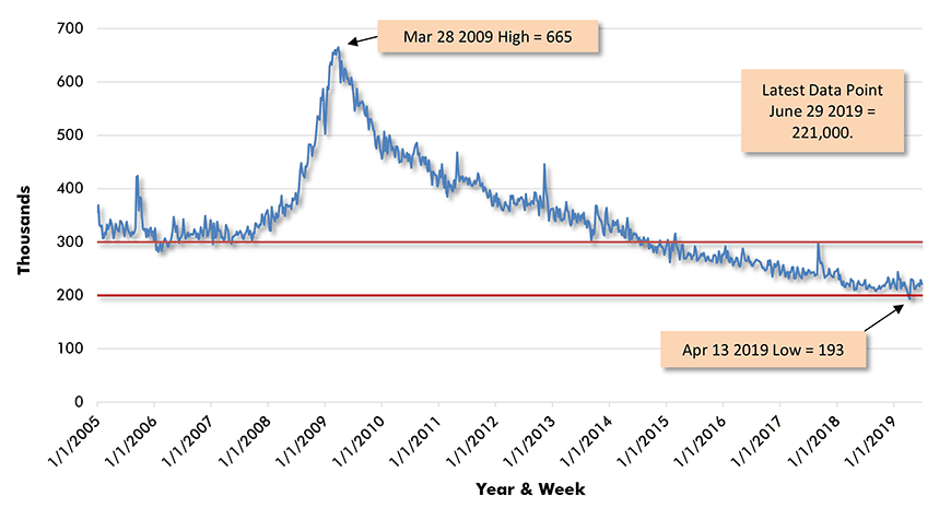
At least with respect to employment, the U.S. economy continues to roar. One of the best indicators of the strength in the jobs market is the ‘weekly initial jobless claims’ data series. It measures first-time applications for unemployment insurance. The figure soars when the economy sinks. As Graph 1 shows, initial jobless claims in the middle of the 2008-2009 recession skyrocketed to 665,000. But they have now been less than 300,000 – i.e., the benchmark usually adopted to denote a solid jobs recovery – for 226 weeks in a row (i.e., more than four years). They even dropped below 200,000 twice in April of this year.
The length of time from high to low in the initial jobless claims curve has been 10 years, exactly corresponding with the duration of the current upbeat economic cycle. When searching for an early warning sign that the economy is faltering, be wary of initial jobless claims rising back to 300,000.
Graph 1: U.S. Initial Jobless Claims Weekly
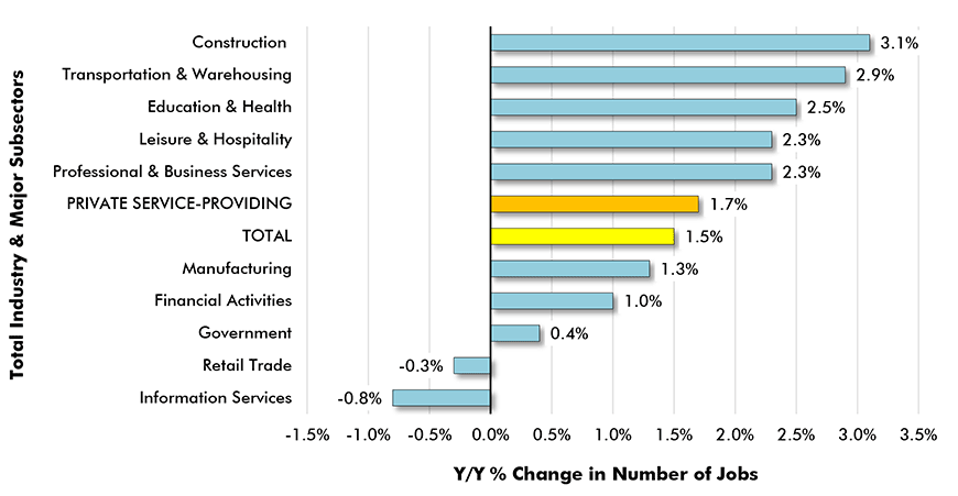
Construction Continues to Lead All Sectors for Y/Y Jobs Growth
In June, construction continued to have the best record of year-over-year hiring among all major U.S. industrial sectors. Construction’s +3.1% pace of jobs growth was double the national ‘all-jobs’ rate of +1.5%. Graph 2 sets out the staffing performances of the other ‘trailing’ sectors. The bulk of jobs in the economy now falls under the designation ‘private service-providing’. In June, the year-over-year gain in services jobs was +1.7%. The other main source of non-services employment, besides construction, is manufacturing. Construction has been consistently beating manufacturing in jobs creation, but that’s partly due to the latter’s embrace of automation.
Graph 2: Y/Y Jobs Growth, U.S. Total Industry & Major Subsectors −
June 2019 (based on seasonally adjusted payroll data)
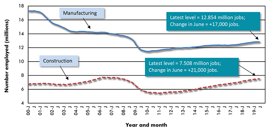
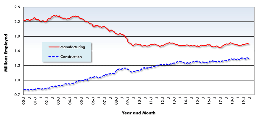
Construction versus Manufacturing Jobs U.S. and Canada
Nevertheless, construction as a source of employment rarely receives the respect it deserves. Graph 3 highlights jobs levels in manufacturing and construction from 2000 to the present. A vast gap in favor of manufacturing at the turn of the millennium has been considerably reduced, although the separation has remained about the same since 2010. In Canada (Graph 4), there has been an astonishing shift in the manufacturing versus construction jobs relationship. Canadian manufacturing jobs fell dramatically from 2004 to 2009, then leveled off. Construction jobs have done nothing but climb since 2000, although the angle of the incline has become more subdued.
Graph 3: U.S. Manufacturing vs Construction Employment
Seasonally Adjusted (SA) Payroll Data
Graph 4: Manufacturing vs Construction Employment in Canada
Seven Priciest Housing Markets in U.S.
A subject of interest to nearly everyone is home prices. The National Association of Realtors (NAR) publishes information on the median selling prices of existing single-family housing in metro areas across the U.S. The ‘median’ is the midway spot at which half the ‘observation points’ lie above it and half are situated below it. In Spring 2019, there were seven U.S. metro areas with median home prices above half a million dollars. Ranked in order, they were: San Jose, $1.22 million; San Francisco-Oakland, $930,000; Anaheim-Santa Ana, $800,000; urban Honolulu, $794,000; San Diego, $620,000; Boulder, $604,000; and Los Angeles, $549,000. Seattle-Tacoma was next at $497,000. The nation-wide y/y increase in median price was +3.9%.
Hit and Miss Retail Sales Figures
Despite the great news about the U.S. jobs market, frown lines have been appearing on the forehead of Jerome Powell, Chairman of the Federal Reserve. In a recent appearance before congress, he indicated more than just a willingness, rather an inclination, to drop interest rates as a pre-emptive strike to keep the economy rolling forward. To no-one’s surprise, stock markets reacted with enthusiasm and the major indices have shot up to new all-time highs.
But are there reasons to be concerned about the economy? Consumer spending is the main power source that drives GDP growth and in June, retail sales were okay (+3.3% y/y) but not outstanding. Buried within total retail, there were several numbers that were encouraging: health and personal care stores, +5.5%; motor vehicle and parts dealers, +4.1%; and non-store retailers (e.g., on-line merchants), +13.4%. Specific to construction, building material store sales were -2.5% y/y.
Fireworks in Canadian Housing Starts & Foreign Trade
Canadian homebuilding lit up in June. Country-wide housing starts, seasonally adjusted and annualized (SAAR), rose by more than a quarter from May to reach 246,000 units. That’s the best monthly level this year and is a match for 2018’s best performance, which also happened to occur in June. The numbers are seasonally adjusted, so it’s not just a summer weather effect.
Total Canadian home starts through the first half of 2019 were -4% compared with January-to-June of 2018. In Canada’s six largest population centers, year-to-date housing starts have been as follow: Ottawa-Gatineau, +26%; Vancouver, +25%; Montreal, +11%; Edmonton, -3%; Calgary, -21%; and Toronto, -26%. Besides the fireworks in housing starts, Canada also had a stellar latest month in foreign trade. For one of the rare times over the past five years, the merchandise trade balance with the world was in surplus (i.e., on the positive, not negative, side of the ledger).


Recent Comments
comments for this post are closed