
‘Run of the Mill’ Trade Deficits in March
The following seven graphs (and one table) show how the U.S. and Canada performed in foreign trade through the first quarter of this year. Of course, Q1 won’t be setting the pattern for the remainder of the year. The COVID-crisis landed hard on both economies in mid-March, throwing all expectations based on historical precedent out the window.

Nevertheless, it’s worthwhile to know from whence we started, as new less certain paths are taken.
The U.S. foreign trade deficit in March was a ‘run of the mill’ -$533 billion USD annualized, comprised of a -$787 billion shortfall in ‘goods’, but a +$254 billion surplus in ‘services’.
Canada’s merchandise trade balance also came up wanting in the latest month, at -$17 billion CAD annualized, but not alarmingly so.
Graph 1: United States’ Foreign Trade: Goods and Services Balance − March 2020
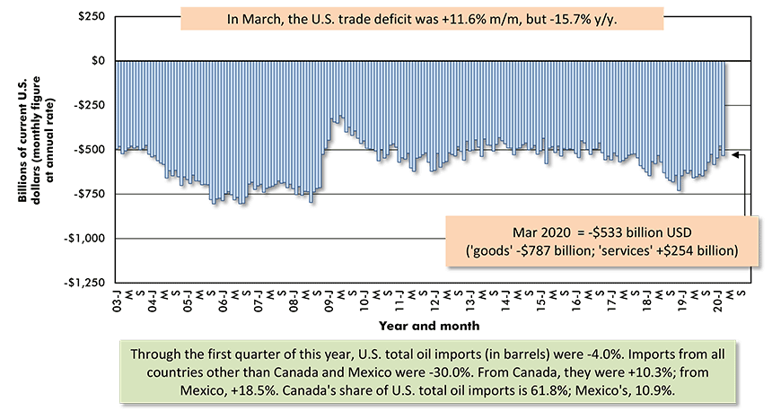
The last data point is for March 2020.
Based on seasonally adjusted monthly figures, projected at an annual rate.
Data source: Bureau of Economic Analysis (BEA).
Chart: ConstructConnect.
Graph 2: Canada’s Foreign Trade: The Merchandise Trade Balance − March 2020
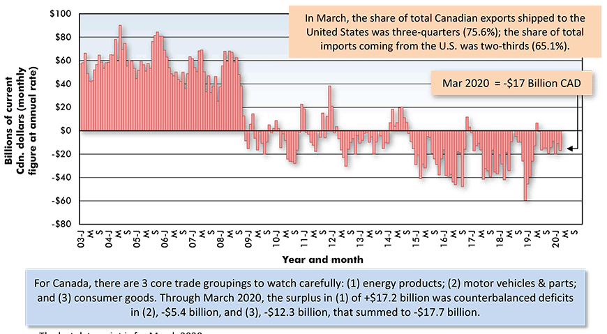
The last data point is for March 2020.
Based on seasonally adjusted monthly figures, projected at an annual rate.
Data source: Statistics Canada.
Chart: ConstructConnect.
Euro Zone Replaces China as Source of Shortfall
The most striking feature of the U.S. trade deficit in March was the shift in its trading partner origins. China ceased being the major contributor. China’s share of the deficit fell to only 20%, from a previous level that usually ranged from 40% to 50%. Factory shutdowns on the other side of the Pacific inhibited supply chain flows.
Now that China’s economy is up and running again, March’s setback may prove to be temporary. But the full scale of the shocks to America’s consumer buying patterns and industrial production, due to the pandemic, remain unknown.
The Euro area in March accounted for the largest chunk of the U.S. trade deficit, at one-quarter. Furthermore, almost all of that 25% slice originated with only two countries, Germany (10.0%) and Ireland (9.9%). The excess of imports over exports with Germany results from motor vehicles and precision equipment. In trade with Ireland, it’s pharmaceuticals and blood plasma products that arrive in abundance.
Graph 3: Geographic Sources of Total U.S. Foreign Trade Deficit in Goods − March 2020
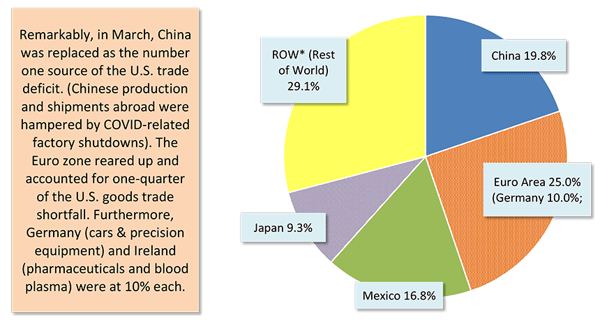
*Major contributors to ROW deficit are South Korea, Taiwan, India and Malaysia.
Data source: U.S. Census Bueau and Bureau of Economic Analysis (BEA).
Chart: ConstructConnect.
U.S. Oil Imports from Non-USMCA Partners -30%
Oil imports used to be a major source of the U.S. trade deficit. That’s no longer the case. U.S. oil imports, measured in number of barrels, have been declining since 2004-2006 (see Graph 5).
In the current year’s first quarter, U.S. total oil imports were -4.0%. Imports from all countries other than Canada and Mexico were -30.0%. Imports from Canada were +10.3% and from Mexico, +18.5%.
Imports from OPEC nations in Q1 2020 were -37.4%.
By the way, the share of total U.S. crude imports coming from Russia is still minimal, at only 2%, but that nation has risen from nowhere to become the seventh ranked foreign supplier ‒ ahead of Brazil, Nigeria and the U.K.
Nigeria really needs a helping hand. Its economy is highly dependent on oil revenues, which have been under severe strain. At the same time, the coronavirus has been ravaging the nation’s large and densely packed population of 200 million people.
Table 1: Top Dozen Suppliers of U.S. Oil Imports − March 2020 Year-to-date (Ytd)
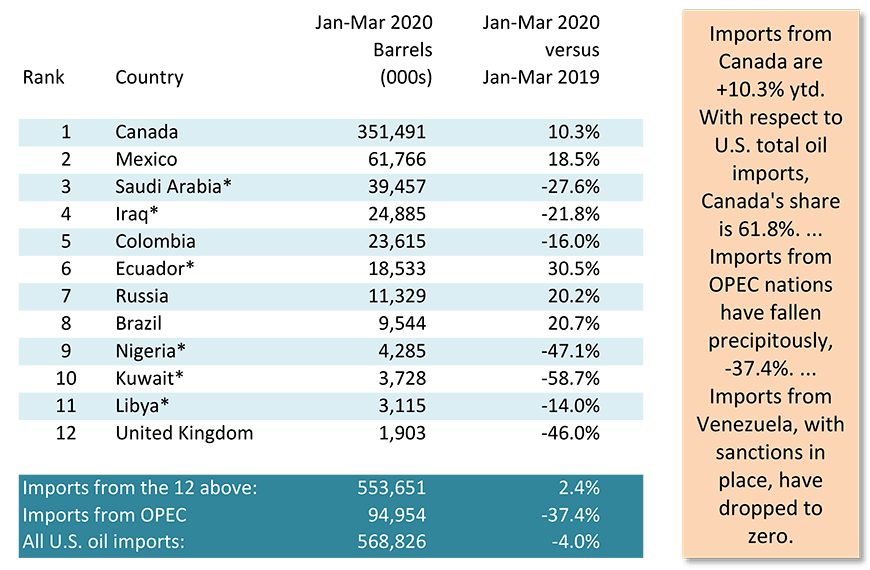
* Denotes OPEC nations.
Data source: U.S. Bureau of Economic Analysis (BEA).
Chart: ConstructConnect.
Nearly 3/4s of U.S. Oil Imports from Canada & Mexico
Barrels of oil from Canada and Mexico now make up nearly three-quarters (72.7%) of U.S. total oil imports. Canada claims 61.8%; Mexico, 10.9%.
Saudi Arabia is in third spot with a 6.9% share. The proportion taken by all OPEC nations is 16.7%.
Graph 6 highlights the remarkable fashion in which the shares taken by OPEC and Canada have reversed positions. In 2000, OPEC was at 50% and Canada, 15%. Through Q1 of this year, it was OPEC at 16.7% and Canada, 68.1%.
On April 20th, the price of West Texas Intermediate oil (WTI) dropped below zero, and who managed to grab what share of U.S. total oil imports seemed irrelevant.
The price has since firmed up, however, to around $30 USD per barrel, thanks to OPEC and several other key supplier nations (e.g., Russia and Mexico) agreeing to production cutbacks, plus an anticipation of greater demand as the world economy struggles back to its feet.
Graph 4: Foreign Sources of U.S. Imported Oil
% of Total Barrels Year to Date − March 2020 Year to Date
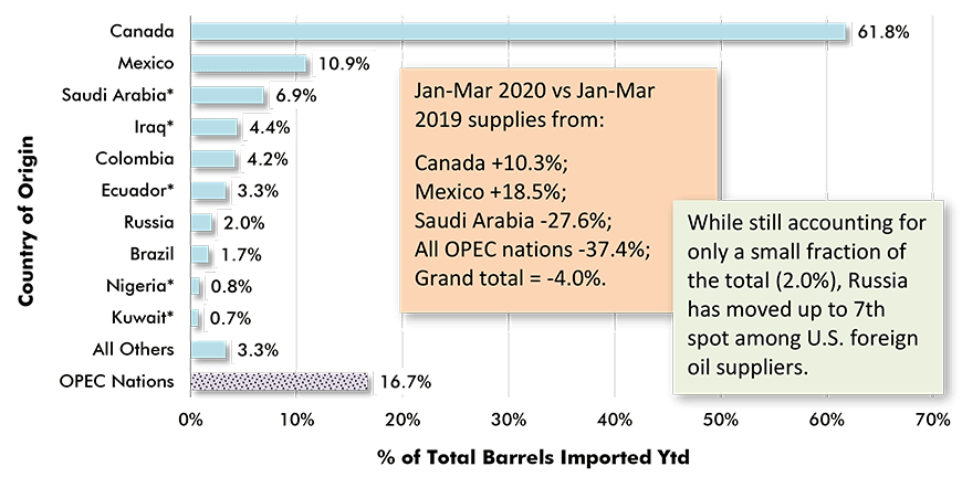
* Asterisk indicates the country is an OPEC member.
Data source: Census Bureau & Bureau of Economic Analysis (BEA).
Chart: ConstructConnect.
Graph 5: Canada vs OPEC as Sources of U.S. Annual Oil Imports
From Time of 1973 OPEC Oil Embargo
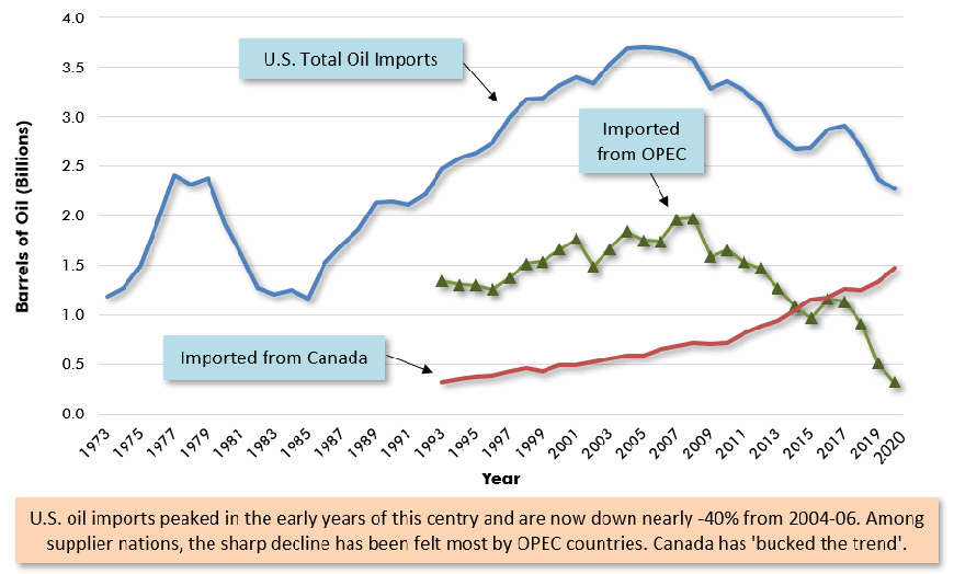
Data sources: Census Bureau, Bureau of Economic Analysis (BEA) & Energy Information Administration (EIA).
Chart: ConstructConnect.
Graph 6: Shares of U.S. Total Oil Imports (Barrels)
Sourced from OPEC and Canada
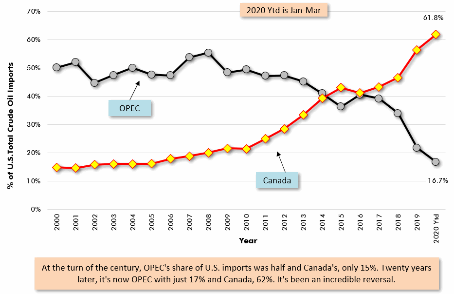
Data sources: Census Bureau, Bureau of Economic Analysis (BEA) & Energy Information Administration (EIA).
Chart: ConstructConnect.
British Columbia Takes Harshest Export Hit
Among Canada’s provinces, Alberta currently has one of the worst-hit economies. Its unemployment rate, at 13.4%, is second worst, beating only Quebec, 17.0%.
Furthermore, the price of Western Canadian Select (WCS) oil from Alberta carries a discount of $10 USD per barrel relative to WTI.
Nevertheless, the dollar volume of Alberta’s energy product exports in Q1 was +11.8% compared with Q1 2019. Among the 19 provincial export categories spelled out along the right-hand vertical axis of Graph 7, ‘Alberta energy products’ is the biggest by dollar volume.
Second-biggest are ‘Ontario motor vehicle and parts’ exports. They were a disappointment in 2020’s first quarter, at -11.1% y/y.
From Graph 7, it appears Quebec had a decent enough export quarter, with aerospace products in the lead (+11.6%). Don’t look for that uplift to continue, though. Air traffic and planes production are both now in tailspins.
British Columbia, on the other hand, had nothing to cheer about with respect to its exports in Q1. It bears noting that B.C. energy exports (-28.5% y/y) are of natural gas rather than oil.
Graph 7: Canada’s Key Export Product Sales by Province Ytd −
Jan-Mar 2020 vs Jan-Mar 2019
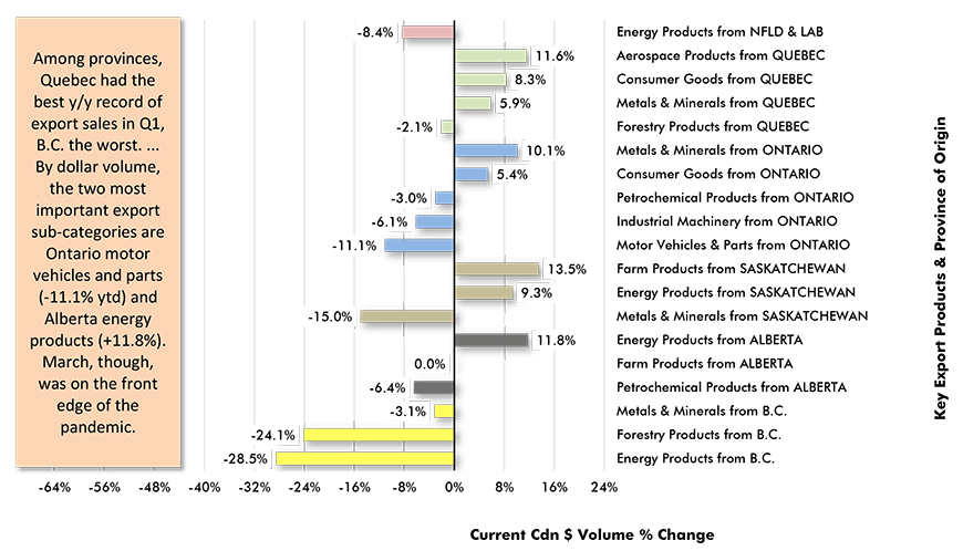
Data source: Statistics Canada Table 12-10-0119-01.
Chart: ConstructConnect.
Alex Carrick is Chief Economist for ConstructConnect. He has delivered presentations throughout North America on the U.S., Canadian and world construction outlooks. Mr. Carrick has been with the company since 1985. Links to his numerous articles are featured on Twitter @ConstructConnx, which has 50,000 followers.


Recent Comments
comments for this post are closed