
Harsh March Followed by Sprightly April on Stock Exchanges
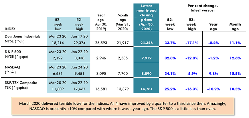
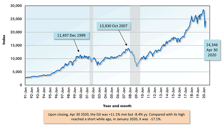
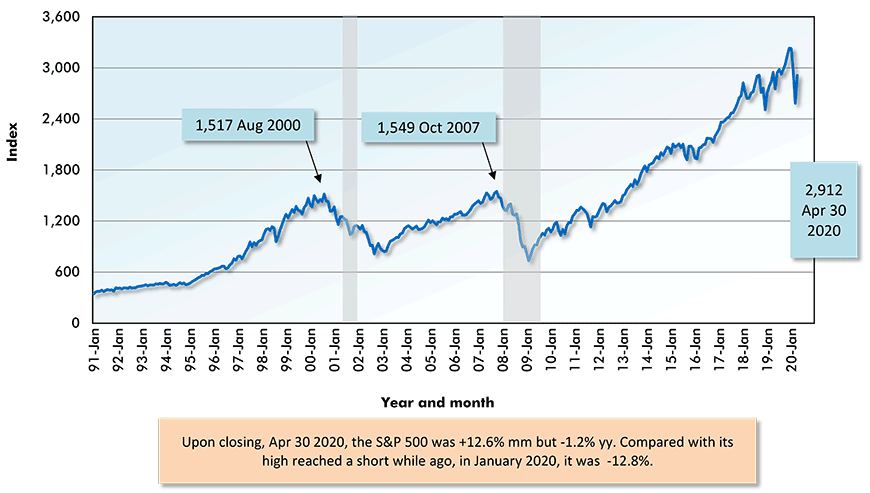
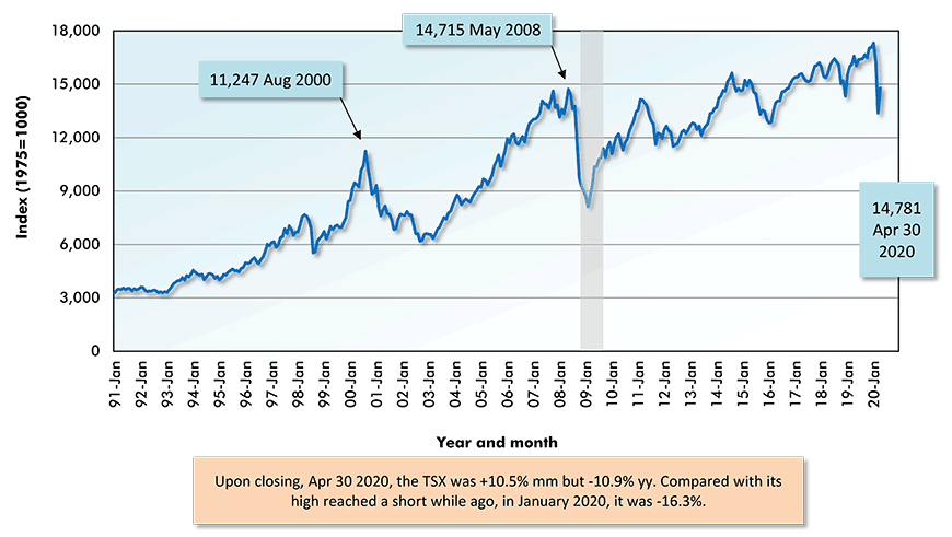
North America’s four major stock market indices, as shown in Table 1, all recorded strong recent month-to-month performances. They managed double-digit percentage gains from month-end closings in March to month-end closings in April. The appreciations ranged from a low of +10.5% for the Toronto Stock Exchange to a high of +15.5% for NASDAQ. In between were the DJI, at +11.1%, and the S&P 500, at +12.6%.

Apparently, a great many investors concluded that the enormous drops in equity prices in March offered opportunities to buy at bargain basement levels. But at least one consummate professional among stock pickers, Warren Buffet, wasn’t having any part of the euphoria. His investment firm, Berkshire Hathaway, has spent the last little while divesting holdings of airline shares.
After swearing to stay away from the airlines, put off by too much uncertainty about jet fuel costs and passenger loads, Mr. Buffet began to take a ‘flyer’ on the sector in 2016. By early this year, 2020, he had accumulated from 9% to 11% of the shares of each of the four major U.S. carriers, American, Southwest, Delta and United.
Those shares have now all been sold to other more optimistic risk takers.
Most analysts expect the GDP slides in the U.S. and Canada this year to be every bit as severe as during the 2008-2009 Great Recession. Certainly, the order of magnitude of job losses seen in the last six weeks has been greater than encountered before, barring the Great Depression.
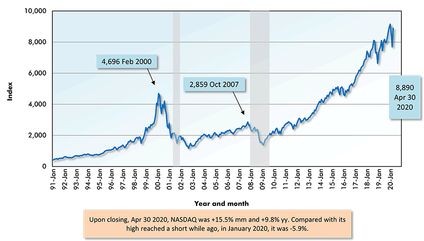
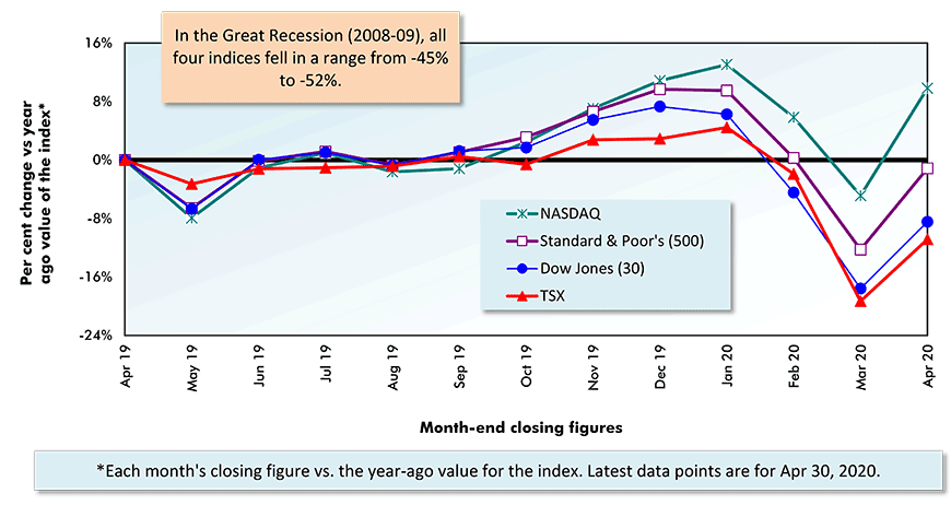
And yet, share prices are still holding up relatively well. NASDAQ is even ahead of where it was a year ago, +9.8%. The S&P 500 is just a shade below flat, -1.2%
In the ‘financial crisis’ period of 2008-2009, the bite taken out of all four major stock market indices was approximately one-half (-50%). There would seem to be a good chance that the roller coaster train in stock market prices that is currently chugging up the lift hill will pause for a second at the top, then begin a hair-raising descent once again.
Securities Dealers Automated Quotations (NASDAQ), Toronto Stock Exchange (TSE) and Reuters.
Table: ConstructConnect.
Securities Dealers Automated Quotations (NASDAQ), Reuters & Yahoo.
Chart: ConstructConnect.
The Savings Rate and the Velocity of Money
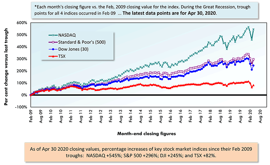
Nevertheless, there’s the quite valid question, “Why are stock markets continuing to do so much better now than in the 2008-09 recession?”
Some of the explanation is to be found in two economic measures that only rarely receive much attention, the savings rate and the velocity of money. They usually play second fiddle to flashier figures on jobs growth, retail sales and interest rates.
The ‘personal savings’ calculation flows as follows. Gross earnings minus taxes is known as disposable income. In turn, disposable income minus expenditures equals the ‘savings’ figure. ‘Savings’ divided by ‘disposable income’ is the saving ratio or rate.
The personal ‘savings rate’ in the U.S. in March was the third highest on record. It shot up to 13.1% from 8.0% in February. Only twice before, in November 1981, at 13.2%, and in May 1975, at 17.3%, was the latest figure surpassed.
‘Personal savings’ amounts are defined to include cash, funds held in ‘near cash’ (bank accounts) and quickly convertible notes, bonds, mutual funds and ‘non-aggressive’ stock market holdings (including in retirement plans). Participation in a number of these provides support for stock market prices.
Then there’s the velocity of money, which is the speed at which each dollar keeps cycling through the economy. Technically, ‘velocity’ is calculated as current dollar gross domestic product divided by the money supply (M1 and M2 usually).
‘Velocity’ has been falling over many years, putting a damper on inflation and implying low interest rates. With low interest rates, there’s an incentive to switch assets away from bank accounts and low-paying notes in favor of equities.
Entering the 2008-2009 downturn, versus the present ‘softness’, interest rates were considerably higher (although they were quickly adjusted downward), the savings rate was lower, and the velocity of money was faster.
There’s also an easier way to understand why the stock market indices have been almost holding their ground. Compared with real estate, commodities, currencies and fine art, speculation in shares has been the more accessible, and intermittently rewarding (under current circumstances), game in town for those in isolation sitting at their computers.
Securities Dealers Automated Quotations (NASDAQ), Toronto Stock Exchange (TSE) and Reuters.
Chart: ConstructConnect.
Securities Dealers Automated Quotations (NASDAQ), Toronto Stock Exchange (TSE) and Reuters.
Chart: ConstructConnect.
Securities Dealers Automated Quotations (NASDAQ), Toronto Stock Exchange (TSE) and Reuters.
Chart: ConstructConnect.
Securities Dealers Automated Quotations (NASDAQ), Toronto Stock Exchange (TSE) and Reuters.
Chart: ConstructConnect.
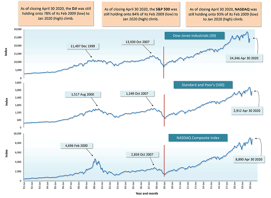
1) New York Stock Exchange – Dow-Jones Industrials (30);
2) New York Stock Exchange – Standard and Poor’s (S & P) (500);
3) National Association of Securities Dealers Automated Quotations – NASDAQ Composite Index;
4) Toronto Stock Exchange – S & P/TSX Composite.
Securities Dealers Automated Quotations (NASDAQ), Toronto Stock Exchange (TSE) and Reuters.
Chart: ConstructConnect.
Securities Dealers Automated Quotations (NASDAQ), Toronto Stock Exchange (TSE) and Reuters.
Chart: ConstructConnect.
Year over Year as of Month-end Closings, April 30, 2020
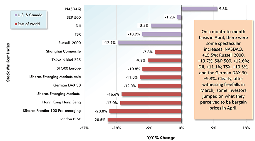
Table: ConstructConnect.
Alex Carrick is Chief Economist for ConstructConnect. He has delivered presentations throughout North America on the U.S., Canadian and world construction outlooks. Mr. Carrick has been with the company since 1985. Links to his numerous articles are featured on Twitter @ConstructConnx, which has 50,000 followers.


Recent Comments
comments for this post are closed