
U.S. Jobs +75,000 in May, but Flat after Revisions
The latest Employment Situation report from the Bureau of Labor Statistics (BLS) records a gain of +75,000 in total U.S. jobs in May. The +75,000 month-to-month increase was the second lowest so far this year. February’s figure was worse at +56,000.

What’s hidden, however, unless one digs a little deeper, is the fact that total U.S. employment in May really didn’t increase at all. The total jobs number now being reported for May, at 151.095 million, is the same as the total jobs number that was published a month ago for April. The explanation lies in the fact that April’s number has been revised down by -75,000.
The national unemployment rate in May stayed extremely tight, at 3.6%, the same as in the previous April. The participation rate likewise remained steady, at 62.8%.
The composition of May’s +75,000 jobs performance was an interesting combination of only +8,000 in goods production, +82,000 in the private services-providing sector and -15,000 with government. The public sector’s jobs loss was at the state (-10,000) and local (-9,000) levels, as Washington made a minor upwards staffing adjustment (+4,000).
Construction and Manufacturing Jobs Fare Poorly
Neither the construction nor manufacturing sectors fared well in the latest jobs report. The former lifted payrolls by only +4,000 and the latter, by a similarly tepid +3,000.
Construction’s unemployment rate, though, was a miniscule 3.2%. A year ago, it had also been good (4.2%), but not as historically-low good as in this May.
The best records of employment change among industrial sectors in the latest month came in ‘professional and business services’, +33,000; ‘education and health services’, +27,000; and ‘leisure and hospitality’, +26,000. ‘Accommodation and food services’ hiring within ‘leisure and hospitality’ was a robust +22,000 jobs.
Besides ‘government’, ‘retail’ (-8,000) and ‘information services’ (-5,000) shed workers.
Wages Moving Up at Snail’s Pace
The jobless rate in the U.S. economy may be about as low as it can go, but that still isn’t having much of an impact on nominal compensation.
For all workers in May, the average weekly and hourly earnings climbs, year over year, were +3.1% and +2.8%. Construction workers did a little better hourly, +3.2%, but trailed weekly, +2.2%.
For strictly production and nonsupervisory workers in the latest month, the hourly and weekly paycheck increases were +3.4% and +2.7%. Construction workers, as a subset within all workers and omitting bosses as well, stayed even with everybody else hourly, at +3.4%, but fell behind weekly, +1.9%.
What’s a ‘Yield Curve’?
Henceforth, at this late stage of the business cycle, weakness in jobs growth will be greeted with extraordinary alarm. The reason ties to another indicator which suggests a recession may be on the horizon. The metric inspiring negative conversation about the economy centers on what is termed an inverted yield curve.
As a first point of business, there should be an explanation of a yield curve. It’s a graph that plots the nominal interest rates on a selection of government debt instruments with different maturity dates. In normal financial circumstances, debt instruments with shorter maturity dates have lower interest rates than those that come to term way out in the future.
The first couple of lines (i.e., for June 2016 and June 2017) in Graph 1 are ‘normal’ yield curves. The interest rates on Treasury Bills of less than one-year’s duration are considerably lower than on bonds that don’t expire for five, ten and 30 years.
In the third curve (for June 2018), however, the slope is beginning to flatten, with short-term rates rising closer to long-term rates. The Federal Reserve, by then, had launched its ‘interest rate normalization’ initiative. (In theory, ‘normalization’ would move the policy-setting federal funds rate from near zero into a range between +2.5% and +3.5%.)
In the fourth curve (for early-June 2019), one-month, three-month and six-month Treasury Bill yields have climbed to exceed yields on one-year, three-year, five-year and ten-year government bonds. As noted earlier, this is not a common occurrence.
Graph 1: Shifts in U.S. Yield Curve
(Nominal Annual Rates Payable on Treasury Bills and Bonds)
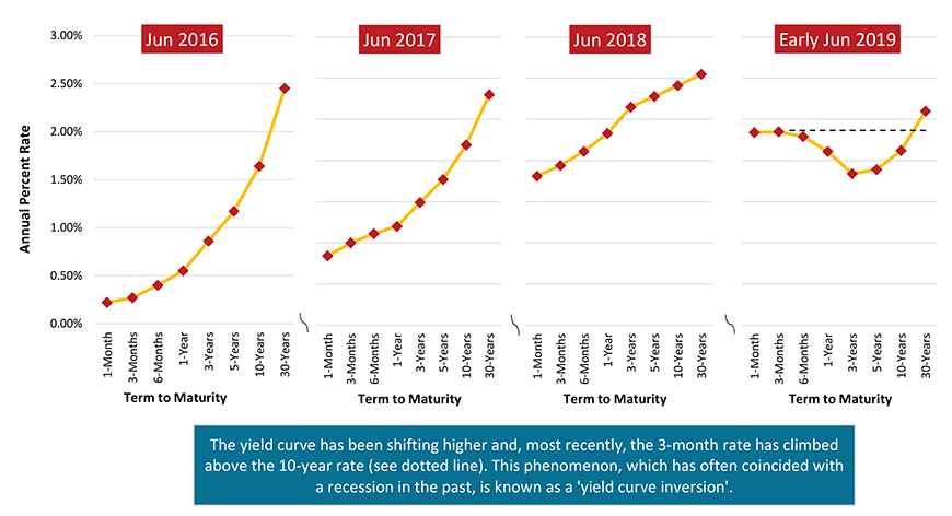
Chart: ConstructConnect.
Why is Inversion so Worrisome?
Why is the early-June 2019 pattern in Graph 1 so worrisome? That question is most clearly answered in Graph 2.
Graph 2 plots the yield on three-month treasury bills and 10-year bonds since 1999. Gray vertical columns denote periods during which the economy has been in recession.
As is immediately apparent, there is correlation between when 3-month rates and 10-year rates move into alignment and when a recession quickly follows.
Turmoil on several foreign trade fronts has already led to speculation the Fed may feel compelled to soon lower, rather than continue lifting, interest rates. There is even conjecture there may be three such cuts.
One of the chief bulwarks arguing against such a measure has been the exceptional strength in the labor market. If that falters, then the Fed may indeed be forced to act.
Graph 2: Correspondence of Inverted Yield Curve and Recessions
(Nominal Annual Rates Payable on Treasury Bills and Bonds)
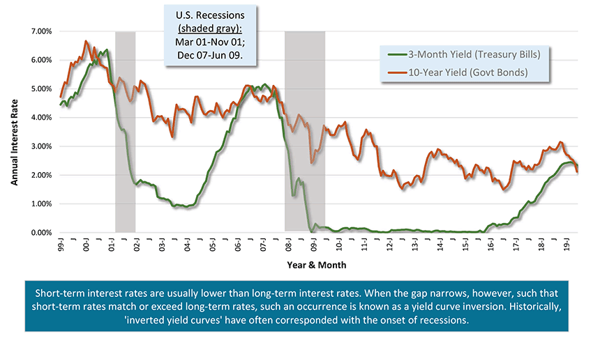
Chart: ConstructConnect.


Recent Comments