
Equities and Jobs Sail Past Each Other
I’m always looking for compelling economic stories. There’s a doozy in the stock markets. Over the course of less than five weeks, from around the middle of February through near the end of March, the four indices highlighted in Table 1 recorded drops of -38% for the DJI, -35% for the S&P 500, -33% for NASDAQ and -38% for the TSX.

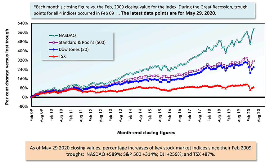
Those are ‘bear’ market percentages (i.e., defined as declines of -20% or steeper). As a point of interest, in the 2008-2009 recession, the contractions by the same four series ranged from -45% to -52%.
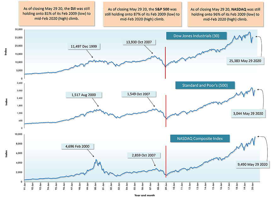
March 23rd was when the stock market indices touched bottom. Two days earlier, on March 21st, the U.S. initial jobless claims number had soared to an unprecedented level of 3.2 million people. Then a week later, on March 28th, the number of first-time unemployment insurance seekers catapulted to 6.9 million.
Currently, the cumulative number of Americans released from their jobs has risen to more than 40 million, or one-quarter of the labor force. Furthermore, the coronavirus pandemic continues to take lives and a vaccine remains, at best, months away from proven efficacy and widespread availability.
Plus, a new feature has been added to an already pockmarked landscape, nightly confrontations in city streets across America between authority figures and protesters who are demanding action to curb instances of over-the-line conduct on the part of the police. A deterioration into looting has been an unfortunate consequence.
Securities Dealers Automated Quotations (NASDAQ), Toronto Stock Exchange (TSE) and Reuters.
Table: ConstructConnect.
Securities Dealers Automated Quotations (NASDAQ), Reuters & Yahoo.
Chart: ConstructConnect.
Stock Markets Recovering with Considerable Pizzazz
What have the North American stock market indices been doing during the past two and a half months? They’ve been recovering with considerable pizzazz.
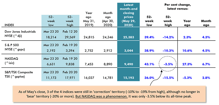
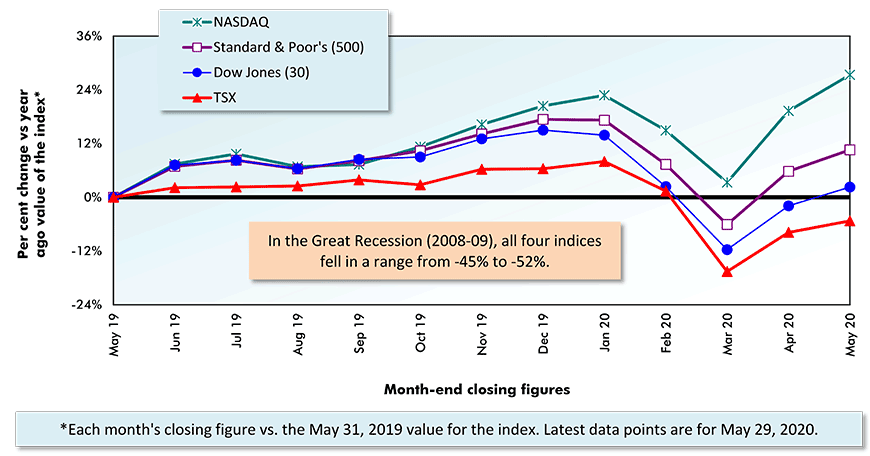
Versus their 52-week lows registered towards the end of March, the four indices closed May as follows: the DJI, +39.4%; the S&P500, +38.9%; NASDAQ, +43.1%; and the TSX, +36.0%.
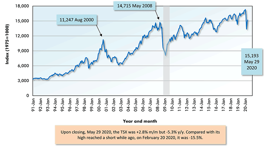
The three U.S. indices were all ahead on a year-over-year basis. Only the TSX was down compared with May 31, 2019, but not terribly so (-5.3%).
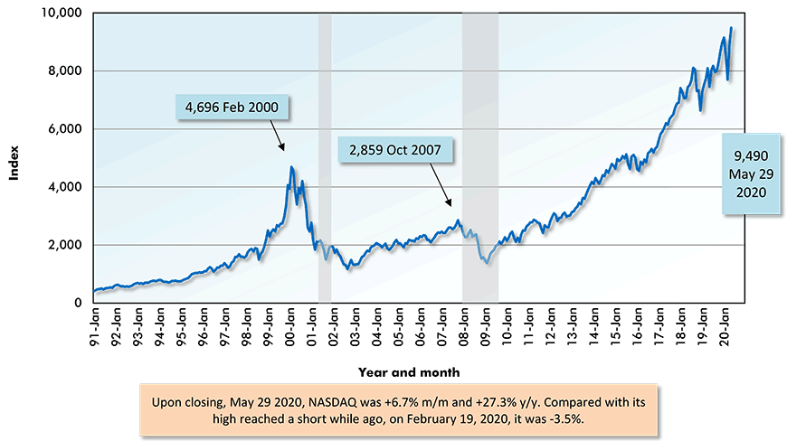
Performing in truly spectacular fashion, NASDAQ at the end of this year’s May, was +27.3% compared with the close of last year’s May. Also, the NASDAQ index was only the shortest of hops, -3.5%, below its all-time high.
1) New York Stock Exchange – Dow-Jones Industrials (30);
2) New York Stock Exchange – Standard and Poor’s (S & P) (500);
3) National Association of Securities Dealers Automated Quotations – NASDAQ Composite Index;
4) Toronto Stock Exchange – S & P/TSX Composite.
Securities Dealers Automated Quotations (NASDAQ), Toronto Stock Exchange (TSE) and Reuters.
Chart: ConstructConnect.
Securities Dealers Automated Quotations (NASDAQ), Toronto Stock Exchange (TSE) and Reuters.
Chart: ConstructConnect.
Interactive Visual
Sources of Investor Optimism
Where is the optimism coming from? The sources can be summarized in bullet points:
- Massive government support measures, encompassing lost-income replacements and supplements, extended unemployment insurance, aid to firms large and small and financial help for specific sectors.
- An expectation of ongoing ultra-low interest rates arising from central bank promises that monetary easing, to whatever degree needed, will be provided.
- Occurrences of new coronavirus cases on the wane.
- The re-opening of state and provincial economies.
- A recovery in oil prices, back to approximately $30 USD per barrel ‒ the brief flirtation with zero dollars per barrel was a stone-in-your-shoe warning of serious trouble.
- China’s economy is on the mend and a new round of infrastructure spending, albeit in non-traditional areas (i.e., geared more towards 5G, AI, biotech and other innovation efforts than bridges and transportation terminals) is about to begin.
- Many firms have demonstrated an ability to survive (some to even thrive) in this difficult environment. Also, while it’s a difficult topic to broach, company staff reductions in many instances have restored health to balance sheets.
The high-tech sector, as represented by the NASDAQ index, was a winner before the onset of the pandemic. Most recently, those aspects of high-tech (i.e., communications) that have helped everyone cope while in full or semi-isolation have increased their perceived value immeasurably.
Furthermore, through tracking and tracing, they’ll be key weapons used to beat COVID-19 into submission.
‘Big Brother’ from the novel 1984 has long served as a warning that technological advances might one day lead to villainous outcomes. If George Orwell were alive today, however, would he be forced to admit that ‘big brother’ can sometimes be put to a friendly supportive purpose.
Year over Year as of Month-end Closings, May 29, 2020
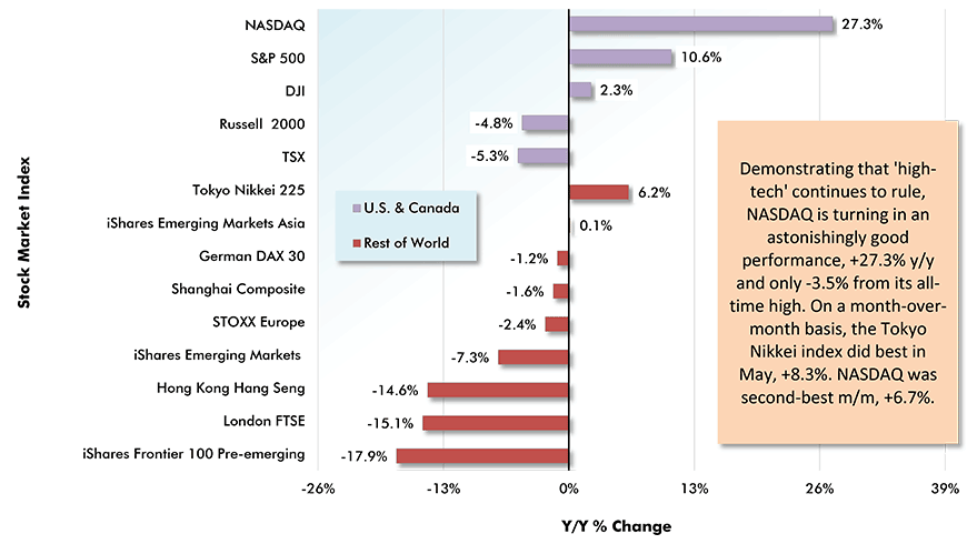
Table: ConstructConnect.
Securities Dealers Automated Quotations (NASDAQ), Toronto Stock Exchange (TSE) and Reuters.
Chart: ConstructConnect.
Securities Dealers Automated Quotations (NASDAQ), Toronto Stock Exchange (TSE) and Reuters.
Chart: ConstructConnect.
Alex Carrick is Chief Economist for ConstructConnect. He has delivered presentations throughout North America on the U.S., Canadian and world construction outlooks. Mr. Carrick has been with the company since 1985. Links to his numerous articles are featured on Twitter @ConstructConnx, which has 50,000 followers.


Recent Comments
comments for this post are closed