
U.S. Housing Starts Surprisingly Buoyant Year to Date
One of the true economic surprises of the pandemic is how little sway it has been holding over housing starts. In the U.S. (Graph 1), the Census Bureau is saying that year-to-date monthly average residential groundbreakings (in units) are +6.5% compared with January-to-September 2019.

In Canada (Graph 9), as reported by CMHC, monthly average starts are basically level with last year, +0.7%, but that’s commendable considering how much havoc has been created elsewhere in the economy by the coronavirus health crisis.
There have been only two months of extreme weakness in U.S. housing starts to date in 2020 that can be attributed to pandemic lockdown measures ‒ April (934,000 units seasonally adjusted and annualized/SAAR) and May (1.038 million units).
In September, American housing starts were back above 1.4 million units. Regionally (Graph 7), on a percentage-change basis, the Midwest has been leading (+12.7%), followed by the West (+6.8%) and the South (+6.1%), with the Northeast (0.0%) in a holding pattern.
Graph 1: U.S. Monthly Housing Starts
Seasonally Adjusted at Annual Rates (SAAR)
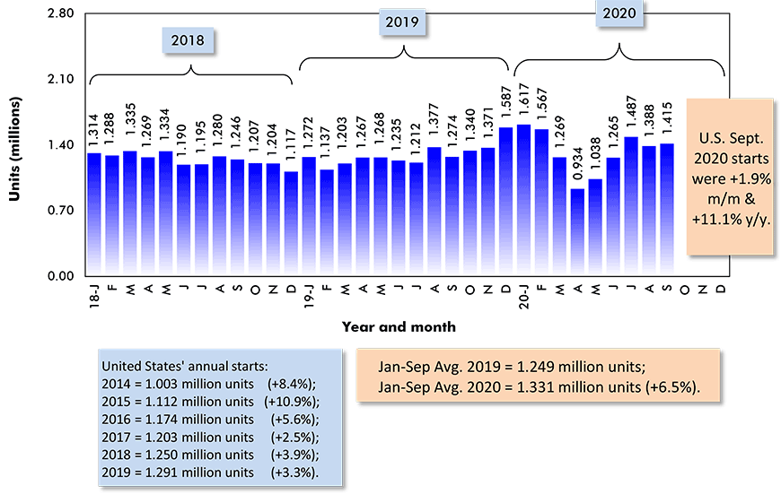
Data source: U.S. Census Bureau (Department of Commerce).
Chart: ConstructConnect.
Graph 2: U.S. Single-Family & Multi-Family Monthly Housing Starts
Seasonally Adjusted at Annual Rates (SAAR)
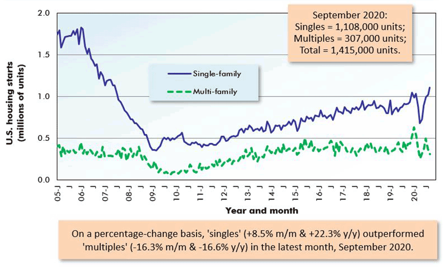
The last data points are for September 2020.
Data source: U.S. Census Bureau (Department of Commerce).
Chart: ConstructConnect.
Graph 3: U.S. Single-Family & Multi-Family Monthly Housing Starts
Seasonally Adjusted at Annual Rates (SAAR)
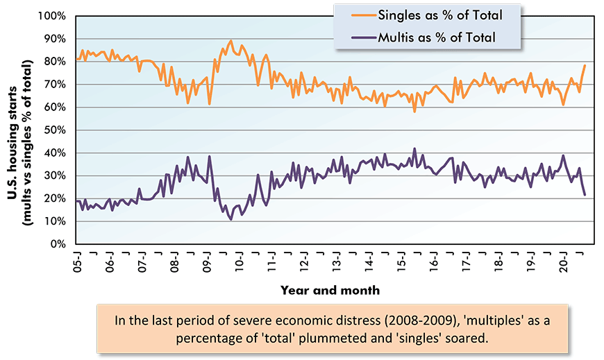
The last data points are for September 2020.
Data source: U.S. Census Bureau (Department of Commerce).
Chart: ConstructConnect.
Graph 4: U.S. Total Monthly Housing Starts
Seasonally Adjusted at Annual Rates (SAAR)
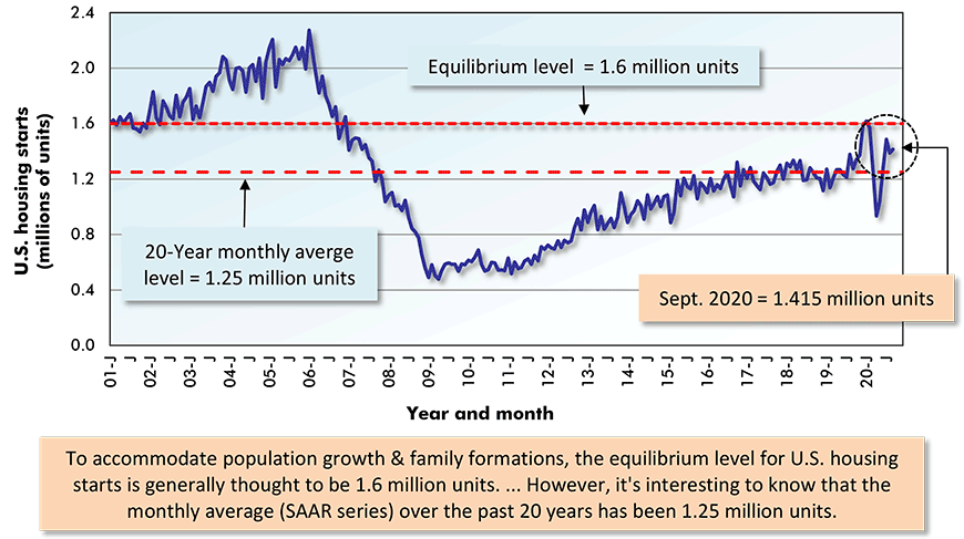
The last data point is for September 2020.
Data source: U.S. Census Bureau (Department of Commerce).
Chart: ConstructConnect.
Just How Low are Interest Rates?
A key factor helping to support new housing construction has been the extraordinary depth to which interest rates have fallen. The rate on 10-year U.S. Treasury Bills first dropped below 1.00 on March 5th of this year. Its current level is 0.83%.
The return on the 10-year government note is one of the benchmarks used when commercial banks set mortgage rates. The 30-year conventional fixed mortgage rate has been under 3.00% since July. Its present ‘hovering spot’ is around 2.80%.
Historical perspective is useful in demonstrating how low yields have become and what an opportunity they present for borrowers. In August of 1981, the 10-year Treasury Bill peaked at 15.51%. For the 30-year mortgage rate, the all-time high has been 18.6%, also occurring in 1981. The long-term average for the 30-year mortgage rate has been just only 8.00%.
Nor is the upward momentum for U.S. housing starts showing signs of flagging. From Graph 5, residential building permits, a leading indicator for later groundbreakings, have roared back after a sharp drop in the spring. September’s permit level was 1.553 million units, indicating that ‘starts’ will continue to be pulled higher, at least for a while.
Graph 5: U.S. Monthly Residential Building Permits
Seasonally Adjusted at Annual Rates (SAAR)
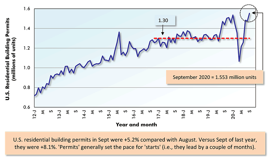
The last data points are for September 2020.
Data source: U.S. Census Bureau (Department of Commerce).
Chart: ConstructConnect.
Graph 6: U.S. Regional Housing Starts
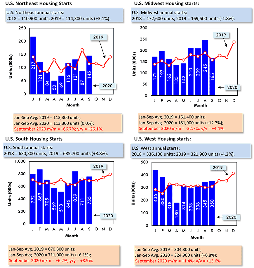
Data source: U.S. Census Bureau (Department of Commerce).
Chart: ConstructConnect.
Graph 7: U.S. Housing Starts
Jan-Sep 2020 vs Jan-Sep 2019 % Changes
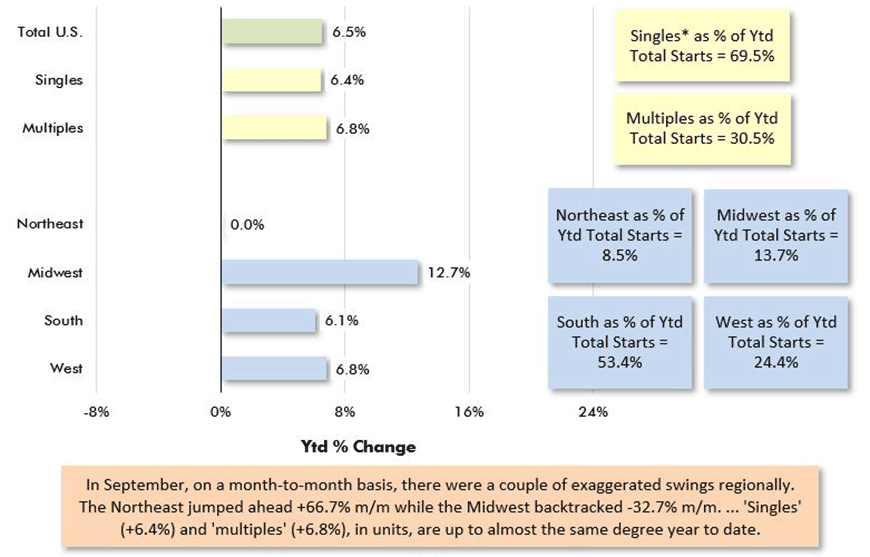
Based on averages of monthly seasonally adjusted and annualized (SAAR) unit starts.
* ‘Singles’ includes townhouse complexes, except when multiple units have common heating & air conditioning.
Data source: U.S. Census Bureau.
Chart: ConstructConnect.
Graph 8: U.S. and Canada Monthly Housing Starts
Seasonally Adjusted at Annual Rates (SAAR)
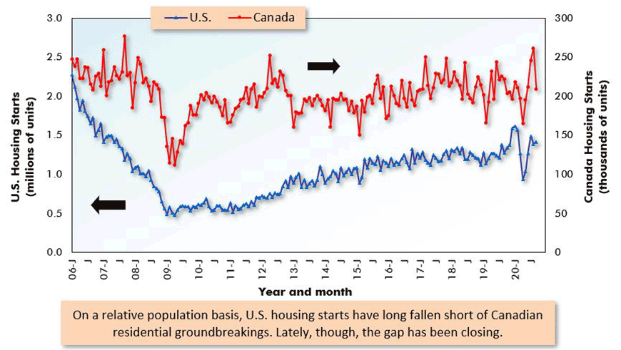
The last data points are for September 2020.
ARROWS: U.S. numbers to be read from left axis; Canadian from right axis.
Data sources: U.S. Census Bureau & Canada Mortgage and Housing Corp (CMHC).
Chart: ConstructConnect.
A Mystery at Heart of Toronto’s New Housing Surge
From Graph 9, Canadian housing starts have seen only one dreadful monthly result since the onset of the coronavirus nightmare. In April, Canadian residential groundbreakings plunged to 165,000 units SAAR. Even that low level, though, wasn’t entirely beyond the pale. After all, in February of last year, the national total was a similarly weak 166,000 units.
To compensate for the shortfall in starts earlier this year, the level nation-wide soared to 246,000 units in July and a truly remarkable 262,000 in August (i.e., one of the highest monthly figures ever), before relaxing to 209,000 in September.
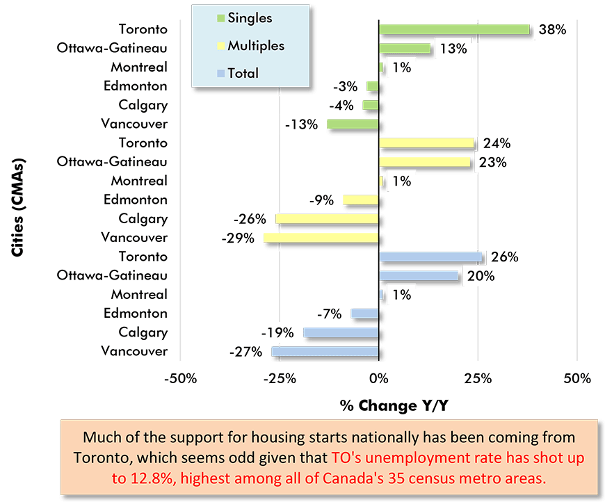
Support for the national number is coming mainly from one region, Toronto and its bedroom communities. Year to date home starts in census metropolitan area (CMA) Toronto are +26%. Nearby, they’re +66% in Barrie, +63% in Oshawa and +15% in Hamilton.
There’s a mystery, though, in how the Toronto marketplace can maintain such a high degree of demand for new homes when the unemployment rate in the city has deteriorated so starkly, to 12.8%. One in eight members of the labor force is out of work in Toronto, the worst record for joblessness among all 35 of Canada’s CMAs.
Also contributing to the riddle is the fact population growth in Canada has slowed to a crawl. Immigration, which has long been counted on to inject vitality into Toronto’s urban scene and to drive living space demand, has withered with the closing of borders. July 1st’s Canadian population count was only +0.1% quarter to quarter.
Graph 9: Canada Monthly Housing Starts
Seasonally Adjusted at Annual Rates (SAAR)
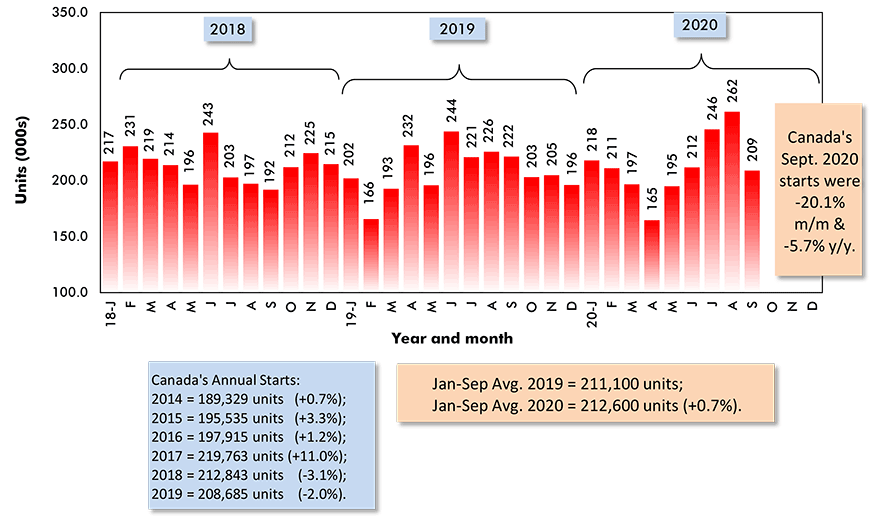
Data source: Canada Mortgage and Housing Corporation (CMHC).
Chart: ConstructConnect.
Graph 10: Percent Change in Year-To-Date Housing Starts –
Ranking Of Canada’s Provinces
(Jan-Sep 2020 vs Jan-Sep 2019)
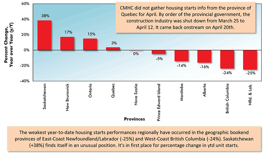
Data source: Canada Mortgage & Housing Corporation (CMHC) based on actuals rather than seasonally adjusted data.
Chart: ConstructConnect.
Graph 11: Percent Change in Year-To-Date Housing Starts –
Ranking Of Canada’s Major Cities
(Jan-Sep 2020 vs Jan-Sep 2019)
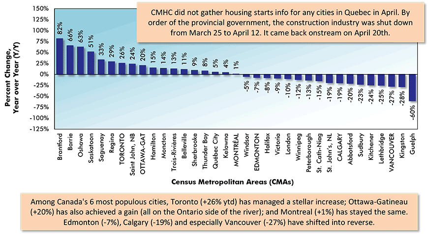
Canada’s Census Metropolitan Areas (CMAs) have core populations of 50,000 plus.
Canada’s 6 CMAs with populations in excess of 1 million are in capital letters.
Data source: Canada Mortgage & Housing Corporation (CMHC) based on actuals rather than seasonally adjusted data.
Chart: ConstructConnect.
Ottawa Uniquely Positioned for Home Starts Success
In addition to Toronto, there is one other big urban area in Canada where new home starts have been solid year to date. The city deserving mention is Ottawa-Gatineau, where residential groundbreakings are +20% ytd, although it’s significant that ‘starts’ on the Ontario side of the river bisecting the twin cities are +31% while on the Quebec side, they’re -5%.
Ottawa-Gatineau, as the seat of the federal government and home to an inordinate number of public sector jobs, has fared better in jobs retention than Canada’s other million-plus population centers. Ottawa-Gatineau’s unemployment rate currently sits at a relatively favorable 8.6%.
The 8.6%, as reported by Statistics Canada, is the average over the latest three months. For Canada’s 35 cities, the three-month average is 10.0%.
The Ontario side of the Ottawa River is recording by far the biggest jump in Statistics Canada’s new home price index, +12.9% y/y. Some other year-over-year index increases are as follows: Montreal, +6.7%; Vancouver, +4.1%; Toronto, +1.9%; and Calgary and Edmonton, both -0.6%.
The national new home price index is +3.4% y/y.
Graph 12: Housing Starts in Canada’s 6 Most Populous Cities
January to September Ytd Actuals
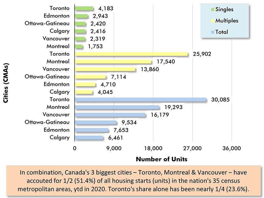
Data source: Canada Mortgage & Housing Corporation (CMHC).
Chart: ConstructConnect.
Graph 13: Housing Starts in Canada’s 6 Most Populous Cities
Jan-Sept 2020 vs Jan-Sept 2019
Data source: Canada Mortgage & Housing Corporation (CMHC).
Chart: ConstructConnect.
Alex Carrick is Chief Economist for ConstructConnect. He has delivered presentations throughout North America on the U.S., Canadian and world construction outlooks. Mr. Carrick has been with the company since 1985. Links to his numerous articles are featured on Twitter @ConstructConnx, which has 50,000 followers.


Recent Comments
comments for this post are closed