
Total Jobs Level Relegates Dark Days to Past
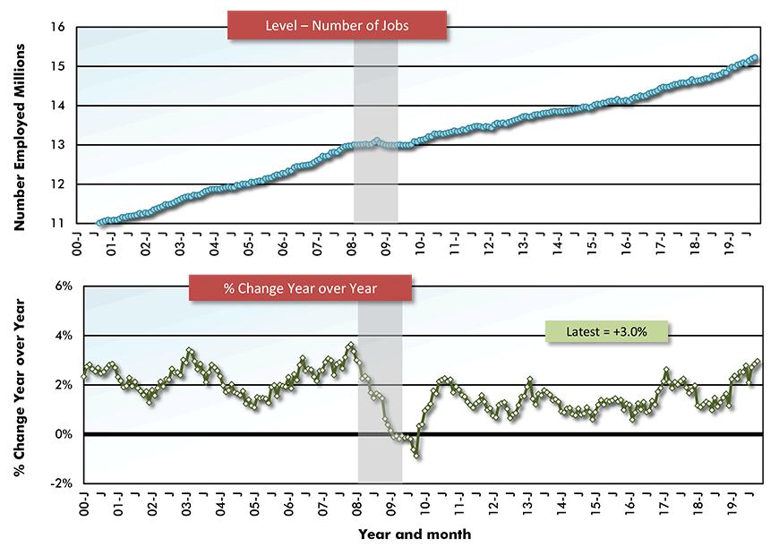
The U.S. economy has been so outstanding at creating jobs over the past ten years that now is a good time to stand back and assess where, among industries, the pickup has been most remarkable and whether there are currently signs of general easing.

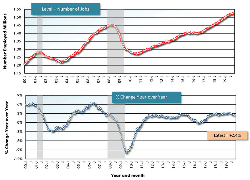
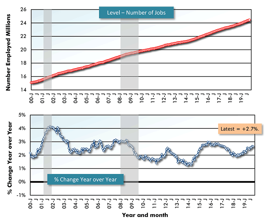
The top half of Graph 1 sets out the level of U.S. total employment from January 2000 to the present. The rectangles of gray shading highlight the last two slowdowns – i.e., the ‘dot.com’ setback in Q2 and Q3 of 2001 and the Great Recession running from Q1 2008 through Q2 2009. The downturns in employment during those time frames is quite evident in both the upper and lower portions of the chart.
What’s also readily apparent, however, is how the past-20-years period, from a number-of-jobs point of view, has split into distinct decades. Total employment at the end of 2009 was slightly less than it was in January 2000. By way of contrast, from January 2010 on, the jobs count has done nothing but ascend.
Between the two recession, the year-over-year performance of total jobs maxed out, briefly, at +2.0%. A couple of years after the Great Recession, the y/y improvement in jobs again rose to +2.0% and stayed around that healthy yardstick for the next seven years. The y/y total jobs figure has been decelerating a bit during this latest year, 2019.
In the context of U.S. total employment growth from 2010 on, the big drop in the total employment ‘level’ during the Great Recession no longer appears as horrendous as it once did. The jobs count has left its darkest days far behind. The overall labor market is no longer being hounded by the past.
Graph 1: U.S. Employment: Total
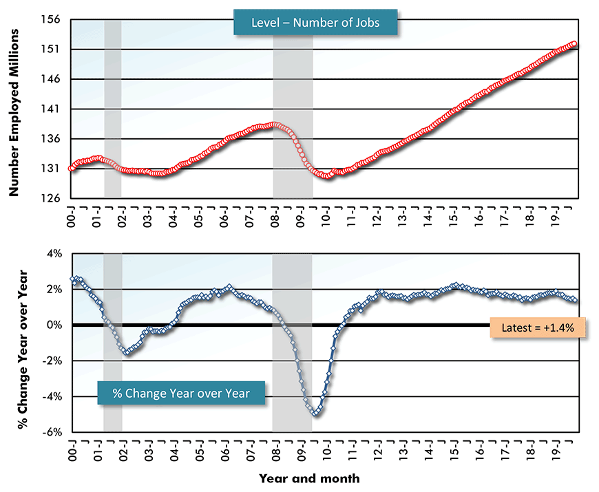
Latest data points are October, 2019 / Based on seasonally adjusted (SA) data.
Chart: ConstructConnect.
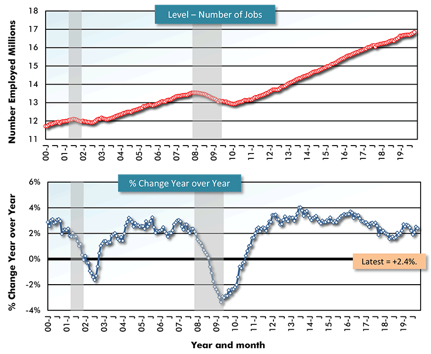
But Manufacturing Still Haunted by Great Recession
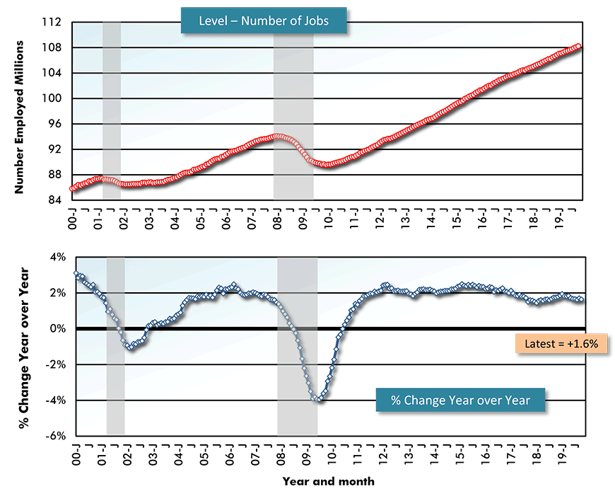
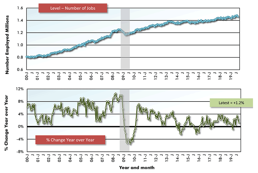
But there are sectoral labor markets within the U.S. economy that continue to be haunted by the Great Recession. They’re mainly within ‘goods’ production, with manufacturing being the prime example.
Due to offshoring of work and adoption of automation, the number of manufacturing jobs fell into decline from 2000 through 2007, then really plummeted during the six quarters of recession from early 2008 to mid-2009. The recovery in total manufacturing jobs since 2010 has been muted.
Since 2011, the year-over-year percentage-change improvements in total manufacturing jobs have been in a range of zero, at worst, to +2.5%, at best. Most recently, the y/y performance has been trending down towards zero.
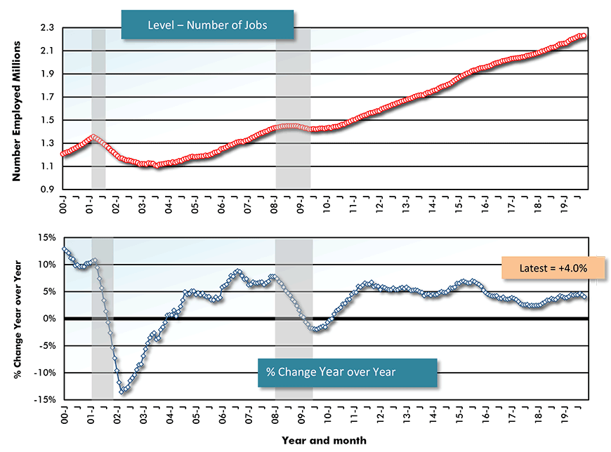
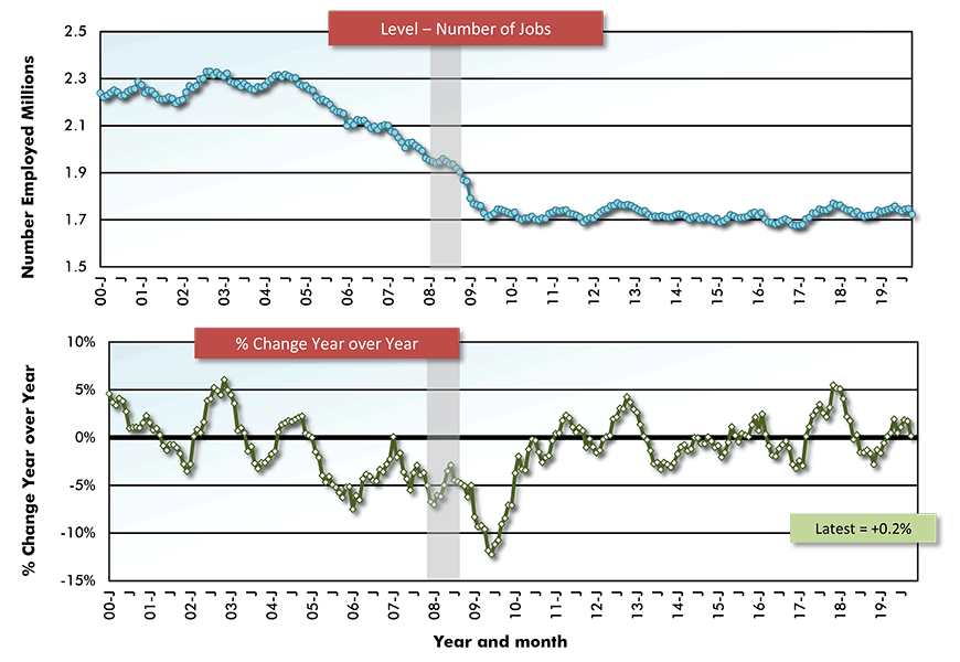
Graph 3 records results for one of manufacturing’s key sub-sectors, motor vehicle and parts production. The shape of the curve for ‘level’ of auto-related jobs closely follows total manufacturing, with a steep slide during the Great Recession, and a gentle uplift since then.
Motor vehicle jobs scored a victory over total manufacturing jobs in mid-2012, however, when they soared to +10.0% y/y. Since then, their y/y advance has been gradually tailing off. In October of this current year, there was a big drop in employment (-5.9% y/y), but that was a one-off caused by the month-long strike at GM.
On a positive note, there have recently been significant investments in auto sector production, including new Fiat Chrysler and Toyota-Mazda assembly lines in Michigan and Alabama and vehicle battery manufacturing plants in Alabama (Mercedes-Benz) and Georgia (SK Innovation).
Graph 2: U.S. Employment: Manufacturing
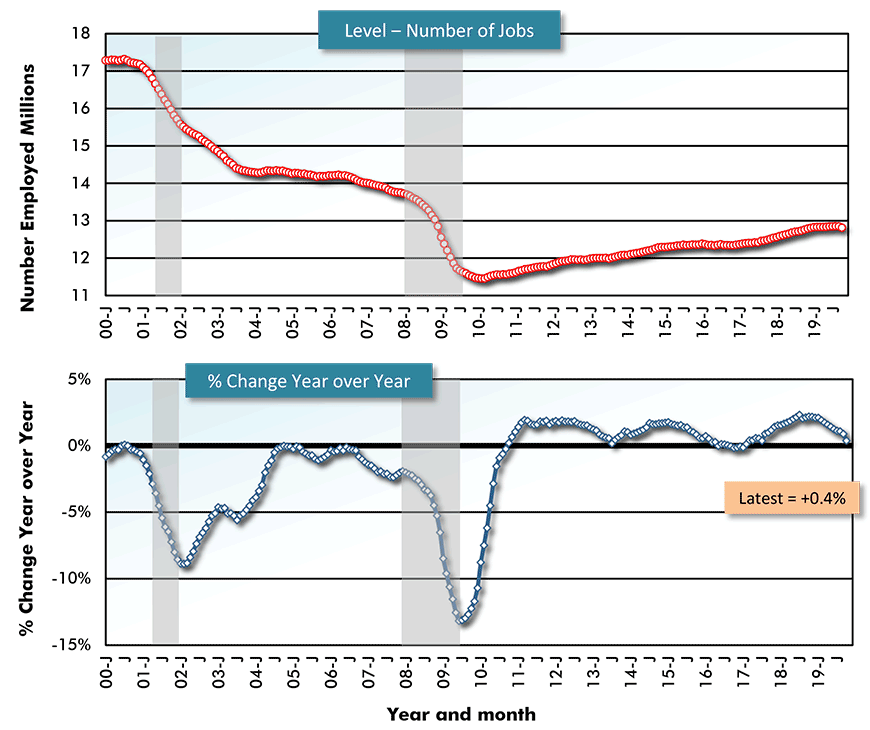
Latest data points are October, 2019 / Based on seasonally adjusted (SA) data.
Chart: ConstructConnect.
Graph 3: U.S. Employment: Motor Vehicles and Parts Manufacturing
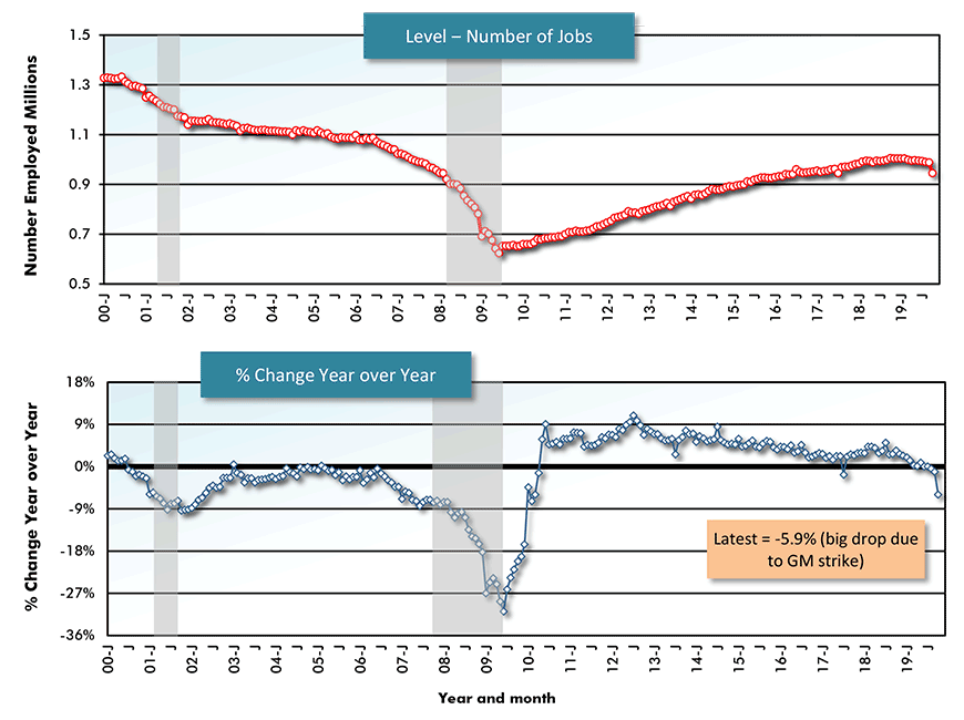
Latest data points are October, 2019 / Based on seasonally adjusted (SA) data.
Chart: ConstructConnect.
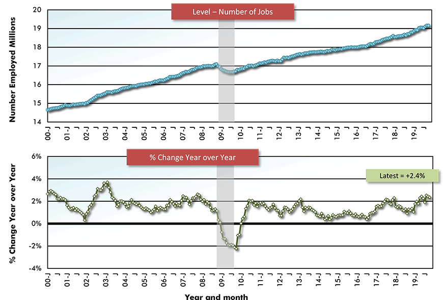
Construction Struggling to Break Free from Last Recession’s Chains
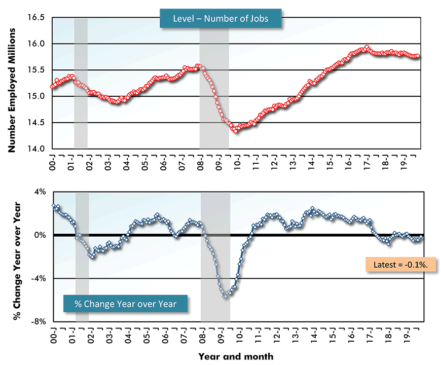
Construction is another sector where the last recession has yet to be fully beaten back and thoughts of the previous trough can still induce cold shivers. From the upper portion of Graph 4, the total number of construction jobs now remains a tad under what was achieved in 2006 and early 2007.
In the Great Recession, auto sector jobs fell by as much as -30% y/y. The construction sector’s jobs count wasn’t battered quite as severely, but -18% y/y was a tough pill to swallow nonetheless.
Since the 2008-09 recession, construction employment y/y peaked at +6.0% in late-2014-early 2015, then stayed robust through mid-2018. During the latest 12 months, though, the curve has been on a downward slope, although +2.0% in October 2019 continues to be lukewarm respectable.
Graph 5 shows an upfront component of the building sector, ‘architectural and engineering services’, where the jobs picture has been somewhat brighter than for overall construction. Total employment in ‘design services’ surpassed its previous peak two years ago and continues to jog higher.
Interestingly, on a year-over-year basis, ‘architectural and engineering services’ jobs did manage +6.0% gains before both the dot.com collapse and the 2008-09 credit crunch. The +6.0% surge ahead of the 08-09 financial crater was fueled by a homebuilding bubble (requiring ‘drawings’) that imploded when the full extent of the sub-prime mortgage fiasco was exposed.
In the latest decade, +6.0% y/y has been unattainable. The y/y change in ‘architectural and engineering services’ jobs has often been +3.0% (i.e., half of +6%), but has never broken above that barrier.
Graph 4: U.S. Employment: Construction
Latest data points are October, 2019 / Based on seasonally adjusted (SA) data.
Chart: ConstructConnect.
Graph 5: U.S. Employment: Architectural and Engineering Services
Latest data points are October, 2019 / Based on seasonally adjusted (SA) data.
Chart: ConstructConnect.
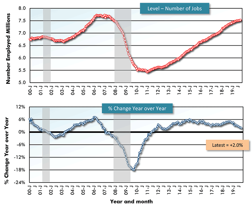
Mega Projects and the Outsized Importance of Energy Sector Jobs
There is another category of ‘goods’ employment that bears scrutiny, oil and gas extraction work While the number of jobs in the fossil fuels field is relatively low (i.e., 200,000 at most), the importance of those jobs has been having an outsized impact on the economy.
The total volume of U.S. construction starts in 2019 to date has been inordinately bumped up by initiations of ultra-large projects, otherwise known as mega projects. ‘Megas’ have estimated values of $1 billion or more each.
The biggest mega projects, of $5 billion and increasing from there, have been energy-related. Among notable construction starts in 2019, LNG export terminals (e.g., Golden Pass in Texas and Calcasieu Pass in Louisiana) have been two such projects, augmented by more traditional ethane cracker and refinery work.
The upper portion of Graph 6 shows that while the ‘level’ of employment in oil and gas extraction contracted dramatically in 2015 through 2018, jobs in the sector over the past two years have come roaring back.
From the bottom portion of Graph 6, the swing in y/y employment has gone from -20% at worst in early 2017 to +11.8% at present. 2014 marked the beginning of a harrowing drop in global oil and gas prices. Lately, world energy markets have managed better price stability.
Graph 6: U.S. Employment: Oil and Gas Extraction
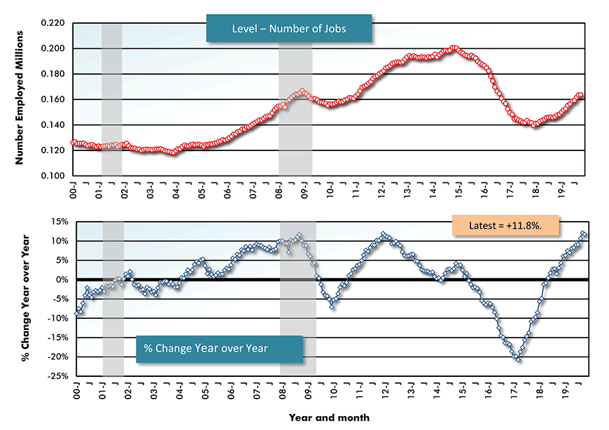
Latest data points are October, 2019 / Based on seasonally adjusted (SA) data.
Chart: ConstructConnect.
Not All Services-Providing Jobs Safe and Secure
Since employment in ‘goods’ production has not generated the smooth upwards progression that is evident for ‘all jobs’ in Graph 1 from 2010 on, it must be ‘services-providing’ work that is providing the consistent advances. Graph 7, which is nearly a replica of Graph 1 in shape, confirms that such is the case.
But not all ‘services’ sub-sectors tell the same story. Retail trade work (Graph 8), for example, has diverged significantly. The ‘level’ of U.S. retail jobs recovered nicely for seven years after the Great Recession, but then crashed into a wall.
The total number of retail jobs in the country over the past three years, coincident with closures of many ‘bricks and mortar’ locations across the land, has been in slow decline.
Graph 9 shows employment in ‘education and health care’. This is social service work that ties to demography. Schooling for younger generations and broad-spectrum medical care, increasingly slanted towards an aging population, are universal needs that will always generate a demand for practitioners and helpers.
From the bottom half of Graph 9, y/y employment in ‘education and health care’ has never been negative in the past two decades, not even during the two recessions. In fact, it has never dipped below +1.0%.
Graph 7: U.S. Employment: Private Services-Providing
Latest data points are October, 2019 / Based on seasonally adjusted (SA) data.
Chart: ConstructConnect.
Graph 8: U.S. Employment: Retail Trade
Latest data points are October, 2019 / Based on seasonally adjusted (SA) data.
Chart: ConstructConnect.
Graph 9: U.S. Employment: Education and Health
Latest data points are October, 2019 / Based on seasonally adjusted (SA) data.
Chart: ConstructConnect.
Reliable Jobs Growth in Leisure-Hospitality and in High Tech
Thankfully, employment in the ‘leisure and hospitality’ sector has been a fallback position for many individuals, especially young adults, seeking work. Graph 10 shows a steady upwards climb in the ‘level’ of leisure and hospitality’ jobs since the 2008-09 recession.
More importantly, though, from 2012 through mid-2017, the y/y change in employment in the sector was mostly between +3.0% and +4.0%, beating the ‘all jobs’ increase of +2.0%.
It’s been no coincidence that hotel and motel construction ‘starts’ also experienced a cyclical boom that began in 2012 and culminated with a peak in 2017.
Finally, Graph 11 shows another services-providing sub-sector which has managed exceptional jobs growth over the long-term. ‘Computer systems design services’ employment encountered a minimal downturn in the last recession and has been growing by +5.0% or more year over year during much of the last two decades.
In October 2019, jobs growth in the sub-sector was still high at +4.0%. There’s good news for the construction industry in these numbers. Many of the new jobs in high-tech require desks, cubicles, labs and meeting rooms, all of which means a need for built-up square footage.
Graph 10: U.S. Employment: Leisure and Hospitality
Latest data points are October, 2019 / Based on seasonally adjusted (SA) data.
Chart: ConstructConnect.
Graph 11: U.S. Employment: Computer Systems Design Services
Latest data points are October, 2019 / Based on seasonally adjusted (SA) data.
Chart: ConstructConnect.
Canadian Employment ‘Steady as She Goes’
Graphs 12 through 15 show the jobs results for Canada in a similar fashion to what has been presented for the U.S. The categories covered are ‘total’, ‘manufacturing’, ‘construction’ and ‘services-producing’.
One difference between the Canadian and U.S. graphs immediately jumps out. Canada has only one gray-shaded rectangle denoting a recession. The U.S. ‘dot.com’ disturbance of Q2-Q3 2001 was not felt to a particularly negative degree north of the border.
As for the 2008-09 recession, Graph 12 establishes that Canada’s decline in employment, at about -2.0%, was not as bad as America’s, -5%.
Also, for Canada as well as the U.S., when year-over-year total employment growth reaches +2.0% or higher, it’s a cause for celebration.
From Graph 13, Canada’s manufacturing jobs count has sunk by nearly one-quarter from the beginning of this century. Unlike the U.S., however, there has been no improvement ‒ i.e., not even a slight recovery ‒ in the manufacturing sector’s jobs level in Canada since the Great Recession.
Whereas U.S. construction employment fell by -18% y/y at the time of the 08-09 recession, the Canadian construction experience (Graph 14) was a relatively tame -6%. Canadian construction jobs during that period were supported by ongoing energy mega project work in Alberta, a government-backed infrastructure spending program and homebuilding activity that faltered slightly, but to nothing like the same degree as south of the border.
Year-over-year Canadian construction employment growth over the past six years (fluctuating around +2.0%), however, has not been as impressively upbeat as it was in the first four years of this latest decade (often +4.0% or more).
As for services-providing jobs in Canada (Graph 15), they retreated by only -1% y/y in the last recession and most recently, they’ve staged a noteworthy breakout. They’ve been +2.0% or higher in every month of 2019 so far. Furthermore, their trajectory has been upwards, taking them to +3.0% y/y in October.
Graph 12: Canada Employment: Total
Latest data points are October, 2019 / Based on seasonally adjusted (SA) data.
Chart: ConstructConnect.
Graph 13: Canada Employment: Manufacturing
Latest data points are October, 2019 / Based on seasonally adjusted (SA) data.
Chart: ConstructConnect.
Graph 14: Canada Employment: Construction
Latest data points are October, 2019 / Based on seasonally adjusted (SA) data.
Chart: ConstructConnect.
Graph 15: Canada Employment: Services-Providing
Latest data points are October, 2019 / Based on seasonally adjusted (SA) data.
Chart: ConstructConnect.
Alex Carrick is Chief Economist for ConstructConnect. He has delivered presentations throughout North America on the U.S., Canadian and world construction outlooks. Mr. Carrick has been with the company since 1985. Links to his numerous articles are featured on Twitter @ConstructConnx, which has 50,000 followers.


Recent Comments